
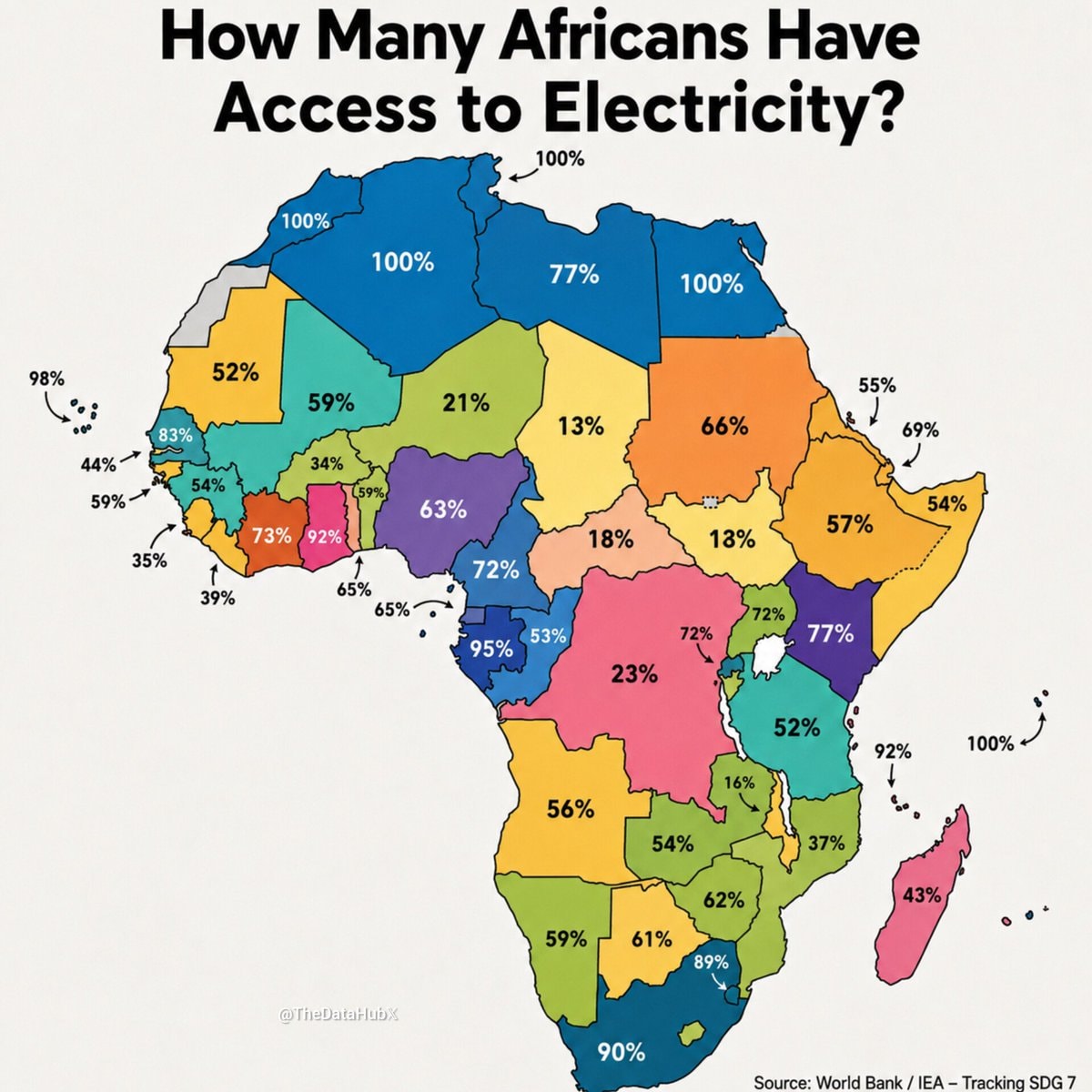
@writersroom.boardwalkHow Many Africans Have Access to Electricity?
View original post@writersroom.boardwalkHow Many Africans Have Access to Electricity?
View original postPhoto by @writersroom.boardwalk· Aug 28, 2026· World Bank
The image is an infographic map of Africa. It displays the percentage of the population in each country that has access to electricity. The map uses different colors to represent the countries and overlays them with numerical percentages. The overall mood is informative and educational. A notable detail is the watermark "@TheDataHubX" in the bottom left corner and the source information "Source: World Bank / IEA - Tracking SDG 7" at the bottom right. The title text reads "How Many Africans Have Access to Electricity?".
@writersroom.boardwalkHow Many Africans Have Access to Electricity?
View original postPhoto by @writersroom.boardwalk· Aug 28, 2026· World Bank
The image is an infographic map of Africa. It displays the percentage of the population in each country that has access to electricity. The map uses different colors to represent the countries and overlays them with numerical percentages. The overall mood is informative and educational. A notable detail is the watermark "@TheDataHubX" in the bottom left corner and the source information "Source: World Bank / IEA - Tracking SDG 7" at the bottom right. The title text reads "How Many Africans Have Access to Electricity?".
No comments yet. Be the first!
No comments yet. Be the first!