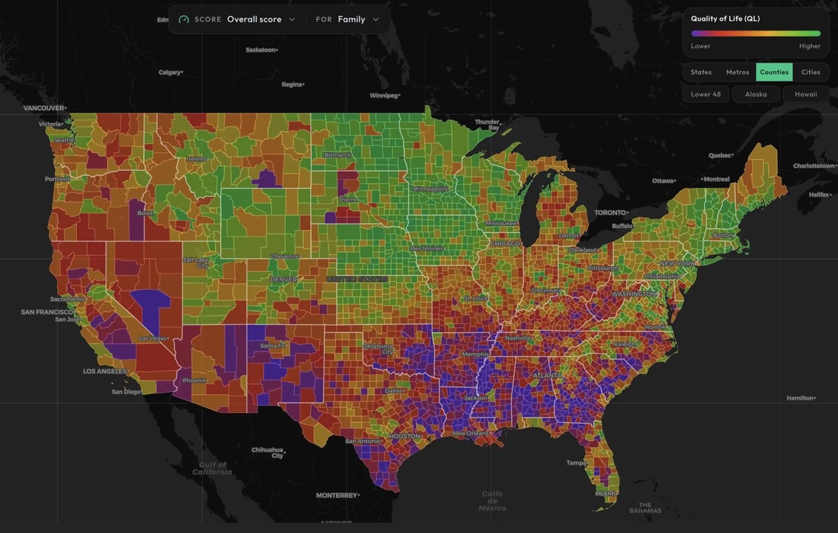
@krzysztof.wWhether a county scores well or poorly on family quality of life comes down to 108 indicators, all pulled from public data. The list runs long: schools and crime, housing and health, what child care costs, air quality, jobs, disaster risk. On the map, green marks the better end of the scale and purple the worse. #UnitedStates
View original post